
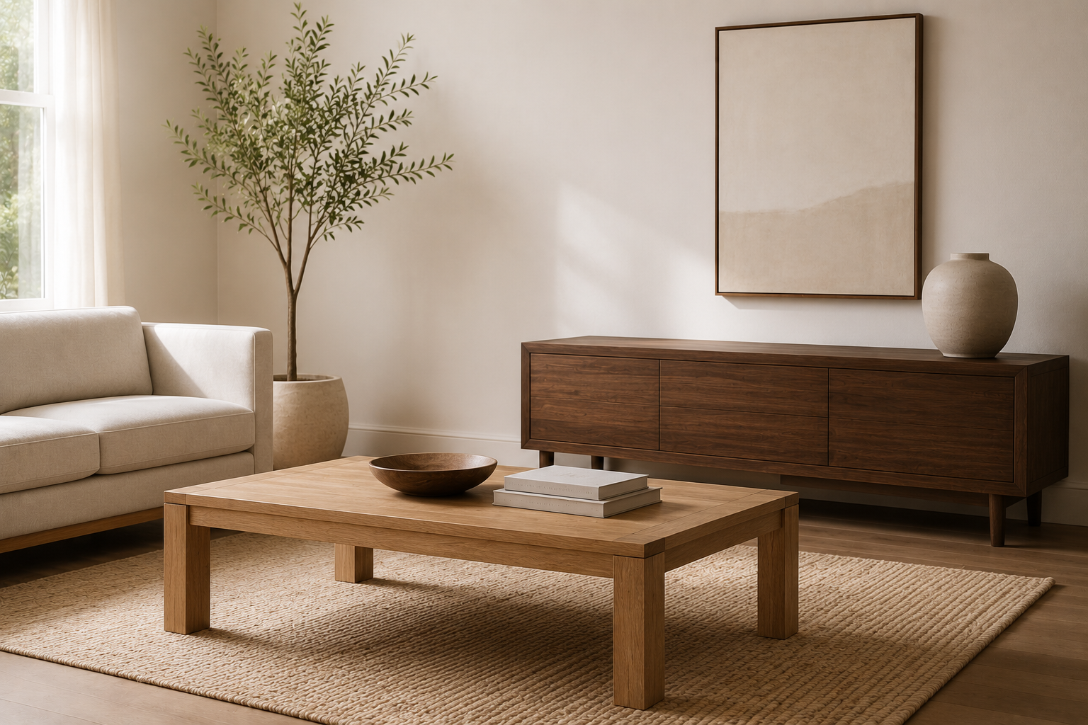
You've been in rooms like this before - rooms where every piece of wooden furniture is the same shade of honey oak, where the coffee table, TV console, and side tables all came from the same collection and arrived in the same finish. The room is coordinated. It is inoffensive. And it is utterly devoid of the warmth and character that wood furniture is supposed to bring to a living space.
This is what happens when people mistake matching for designing. The instinct is understandable - matching feels safe, feels like a guaranteed outcome, feels like the thing that will prevent a mistake. But matching wood tones in a living room produces something that looks assembled rather than considered. It looks like a showroom floor rather than a home that has been lived in, built up, and refined over time.
The alternative - layering different wood tones deliberately -produces rooms that feel genuinely warm, visually interesting, and quietly sophisticated. It is not harder than matching. It requires one shift in thinking: from "these pieces need to match" to "these pieces need to relate." Throughout this guide, you'll learn practical ways to mix wood tones confidently, whether you're choosing a coffee table, console table, sideboard, or other solid wood living room furniture.
"A room where everything matches looks like someone was afraid to make a decision. A room where everything relates looks like someone made a hundred decisions - and got every one of them right."
Why Matching Wood Tones Doesn't Work the Way People Expect
The logic behind matching wood tones seems sound: if everything is the same color, nothing will clash. But this reasoning misunderstands how visual interest works in a room.
When every wooden surface in a living room is the same tone - same warm honey, same dark espresso, same mid-toned walnut - the eye has nowhere to travel. There are no contrasts to engage with, no variation to reward attention, no sense that different elements have been brought together with thought.The room can feel visually flat, even when the individual pieces are beautifully crafted.
There is also a practical problem with matching: it is almost impossible to achieve. Wood is a natural material with color variation between species, between individual trees, and even between boards cut from the same log. Two pieces of furniture sold as "walnut finish" by two different manufacturers will look noticeably different in the same room under the same light. Trying to match them precisely draws attention to the discrepancy in a way that choosing contrasting tones deliberately never would.
The third problem is time. A living room built on matched pieces locks the room into one moment - the moment all the pieces were purchased. As pieces are added, replaced, or handed down over years, the matching breaks down and the room starts to look incoherent rather than considered. A room built on layered, contrasting tones absorbs new pieces far more easily, because the design logic was never "match everything" - it was "create relationships between different things."
The Foundation: Understanding Wood Tone Families
Before layering wood tones with confidence, it helps to understand the three main wood tone families. These broad categories determine whether different pieces of wood furniture feel harmonious or create unnecessary visual tension when placed together.
Light tones include natural, bleached, and whitewashed finishes - the pale, almost blonde end of the spectrum. In living rooms, light wood tones read as airy and contemporary. They work particularly well in Scandinavian-influenced, Japandi, and minimalist interiors where the wood's lightness contributes to the overall sense of space and openness.
Mid tones are the honey, amber, and warm brown finishes that most people think of when they picture "wood furniture." These are the most versatile of the three families - warm enough to feel grounded, light enough to remain visually accessible. Natural mango wood, teak-finished acacia, and many medium oak finishes all fall into this versatile mid-tone family.
Dark tones include deep walnut, espresso, ebony, and near-black stained finishes. Dark wood tones anchor a room - they bring weight, depth, and a sense of permanence that lighter tones can't match. In a living room, dark wood is most powerful when used as an accent rather than a dominant tone, providing a visual counterpoint to the lighter and mid-tone pieces around it.
The key principle for layering wood tones is this: choose pieces from at least two of these three families, and let one family dominate while the others accent. A living room with predominantly mid-tone wood pieces, accented by one or two light pieces and one dark piece, will feel layered and warm. A living room with equal proportions of all three will feel busy and unresolved.
The 60-30-10 Rule Applied to Wood Tones
Interior designers often use the 60-30-10 rule for color, but the same principle works just as well for mixing wood tones in a living room. It provides a simple, practical framework for creating contrast without making the space feel chaotic. .
60% dominant tone. One wood tone family should dominate the room - appearing in the largest or most numerous pieces. This is your anchor. If your floors are mid-tone hardwood, your dominant tone is already established before you choose a single piece of furniture. If your floors are light or neutral, you choose your dominant tone through your largest furniture pieces - typically the coffee table and the console or media cabinet.
30% secondary tone. A second wood tone family appears in secondary pieces - side tables, shelving, smaller storage pieces. This secondary tone should contrast meaningfully with the dominant tone rather than echoing it. If your dominant tone is mid-warm mango wood, your secondary tone might be a deeper walnut or a lighter natural acacia. The contrast is what creates the layering effect.
10% accent tone. A third tone - used sparingly, in smaller accessories or a single statement piece - completes the palette. This accent tone introduces the final layer of visual complexity. It might appear in a carved wooden bowl on the coffee table, a small side table in a contrasting finish, or a piece of wooden wall art. Because it appears in small quantities, it adds interest without disrupting the room's visual coherence.
Applied consistently, this framework creates a living room that feels balanced, layered, and intentionally designed rather than accidentally assembled.

The Grain Question: Why Texture Matters as Much as Tone
When most people think about layering wood tones, they focus on color alone - light versus dark, honey versus walnut. But grain pattern and surface texture are just as important, and overlooking them is one of the most common reasons a layered living room feels incomplete rather than cohesive.
Two pieces of wood furniture in the same approximate color can look visually harmonious or actively jarring depending on their grain patterns. A coffee table in solid acacia with pronounced swirling grain paired with a console in solid mango wood with a tighter, straighter grain creates a textural contrast that is more interesting than the color contrast alone. The eye registers the difference in surface character and finds something to engage with in each piece independently.
Conversely, two pieces in contrasting tones but identical smooth, even grain patterns can feel monotonous - the color contrast is there, but nothing else is contributing to the layered effect. The room has tone variation without texture variation, which produces a less satisfying result than the combination of both.
This is one of the specific advantages of solid hardwood over veneer or MDF furniture in a living room context. Each species of solid wood carries its own grain signature - acacia's swirling, unpredictable figuring; mango's tighter, warmer pattern; teak's pronounced and directional grain. These natural differences in grain character add visual depth to a mixed-wood living room that engineered materials simply can't replicate through finish alone. Read more about why material genuinely matters in our guide on hardwood vs. engineered wood furniture.
How to Layer Wood Tones With Specific Piece Combinations
Understanding the theory is important, but applying it in a real living room is where most homeowners need practical guidance. Here are some of the most reliable ways to mix wood tones, along with furniture combinations that consistently create a balanced, layered look.
Light Floor + Dark Furniture + Mid-Tone Accents
This is one of the most sophisticated and increasingly popular combinations in contemporary US living rooms. Light wood floors - blonde oak, whitewashed pine, pale ash - create a bright, open base. Against this base, one or two dark-toned pieces - a deep walnut coffee table, an espresso-finish sideboard - provide strong visual anchoring. Mid-tone wood accents - such as a honey-finish side table or a natural wood console - bridge the contrast between the light floor and dark furniture, creating a smooth visual transition while keeping the room balanced.
The risk in this combination is that the dark furniture can feel too heavy if it appears in too many pieces. Keep dark tones to no more than two pieces in the room, and let the light floor and mid-tone accents do the balancing work.
Mid-Tone Floor + Mixed Mid and Light Furniture
The most common starting condition in US homes: medium hardwood floors in honey, amber, or warm brown tones. The instinct here is to match the floor with similarly-toned furniture - which produces exactly the monotony described earlier. The better approach is to introduce pieces that contrast with the floor rather than echo it.
Light-toned pieces - a whitewashed or natural finish coffee table, a pale accent table - lift the room away from the floor and create visual separation between the surfaces. A single dark-toned piece - a deep console or media cabinet - anchors the room without competing with the floor's warmth. The result is a room where the floor, the furniture, and the accent pieces all read as distinct layers rather than a single undifferentiated mass of warm brown.

Dark Floor + Light and Mid-Tone Furniture
Dark hardwood floors - deep walnut, ebony stain, dark mahogany - create a dramatic base that can easily overwhelm a living room if the furniture echoes the darkness rather than contrasting with it. The solution is to use the furniture to lighten the room deliberately: a light or natural-finish coffee table, a mid-tone acacia console, a pale wood side table. The contrast between the dark floor and lighter furniture creates a layered look almost automatically. The floor provides the visual anchor, while the lighter furniture adds warmth, balance, and a greater sense of openness.
The mistake in this combination is adding any more dark-toned wood furniture to a room that already has dark floors. The floor is doing the dark-tone work. Everything above it should contrast, not compound.
Practical Rules for Mixing Wood Tones Without Getting It Wrong
If you're unsure how to mix wood tones confidently, these five rules provide a simple framework. They're design principles that experienced interior designers use consistently and they work in virtually any living room, regardless of size or budget.
Rule 1 - Contrast the floor, don't echo it. Whatever your floor tone, your furniture should contrast with it rather than match it. This single rule, applied consistently, prevents the most common version of the matchy-matchy problem.
Rule 2 - Let one tone dominate. In any room with multiple wood tones, one tone should appear in more pieces and more surface area than the others. This creates visual hierarchy - the room has a primary wood character with supporting notes, rather than an equal competition between several tones.
Rule 3 - Vary the finish type, not just the color. A matte natural oil finish beside a satin lacquer finish beside a waxed surface creates textural contrast that reinforces the tonal contrast. Mixing finish types - not just finish colors - is what gives a layered wood room its depth.
Rule 4 - Use grain pattern as a variable. Place a piece with pronounced, swirling grain beside a piece with tight, straight grain. The contrast in surface character adds visual interest that tone variation alone cannot achieve.
Rule 5 - Connect tones through undertones. Different wood tones layer most harmoniously when they share the same undertone family - warm undertones (yellow, orange, red) together, or cool undertones (grey, green, blue-grey) together. A warm honey acacia and a warm deep walnut share the same undertone family - they contrast in depth but harmonize in temperature. A warm honey acacia and a cool grey-stained ash do not share undertones, and the combination will feel discordant regardless of how different their tones are.
"The secret to mixing wood tones isn't courage - it's understanding that contrast and chaos are not the same thing. Contrast is controlled. Chaos is what happens when there is no rule governing the contrast."
What Connects Multiple Wood Tones: The Unifying Elements
Successfully layering wood tones isn't just about choosing complementary colors. It also depends on a few unifying design elements that visually connect different pieces, making the room feel cohesive and intentionally curated rather than randomly assembled.
Leg style is one of the most powerful unifying elements. Living room pieces that share a leg style - tapered legs, turned legs, or straight block legs - read as part of the same family even when their tones and species are completely different. A mid-century coffee table with tapered legs paired with a side table in a contrasting tone but identical tapered legs creates an immediate visual relationship between the two pieces that the tonal difference doesn't disrupt.
Finish type provides a second line of unity. Pieces with similar finish types - all matte, all satin, all hand-oiled - share a surface quality that draws them into the same visual register regardless of color. Two pieces in contrasting tones but matching finish types will feel intentionally related. Two pieces in contrasting tones and contrasting finish types will feel unrelated unless another unifying element connects them.
Scale and proportion are the third unifying element Pieces of similar visual weight - similar heights, similar visual density, similar proportions - relate to each other regardless of tonal difference. A low-slung coffee table and a low console against the opposite wall are visually related by their shared horizontality and profile height, even if their finishes are completely different.
When at least two of these three unifying elements - leg style, finish type, scale - are consistent across the pieces in a room, different wood tones will feel layered and considered rather than random and unrelated. This is the design logic that makes a mixed-wood room feel curated rather than accidental. For guidance on how material and construction decisions underpin these visual relationships, our blog on how Oak & Loom artisans build furniture provides useful context.
The Wood Tone Layering Comparison: What Works and What Doesn't
|
Combination |
Result |
Why |
|
All matching honey tones throughout |
Flat, showroom-like |
No contrast - eye has nowhere to travel |
|
Light floor + dark coffee table + mid accent |
Sophisticated, layered |
Strong contrast with clear hierarchy |
|
Mid floor + matching mid furniture |
Monotonous |
Floor and furniture merge into one mass |
|
Mid floor + light coffee table + dark console |
Warm and resolved |
Contrasts floor in both directions |
|
Dark floor + dark furniture |
Heavy, oppressive |
Darkness compounds darkness |
|
Dark floor + light and mid furniture |
Dramatic and balanced |
Floor anchors, furniture lifts |
|
Warm undertones throughout |
Cohesive despite tone variation |
Shared undertone family unifies contrast |
|
Warm + cool undertones mixed |
Discordant |
Temperature clash overrides tone harmony |
|
Mixed tones + same leg style |
Related despite differences |
Shared design element unifies the room |
|
Mixed tones + mixed finish types |
Requires careful handling |
Works best when another element-such as leg style or scale-creates visual unity. |
A Practical Checklist: Before You Add the Next Piece
Before bringing a new wood furniture piece into your living room, take a moment to work through these questions. They can help you decide whether the piece will strengthen your layered design or disrupt it.
-
What is the dominant tone in my living room currently? Identify the tone that appears in the most surface area - usually the floor and the largest furniture piece. This is your 60%.
-
What tone family does this new piece belong to? Is it adding to the dominant family, the secondary family, or the accent family? If it adds to the dominant family, is the room already at 60% in that tone?
-
Does this piece share an undertone with the existing pieces? Warm with warm, cool with cool. If the undertones conflict, the piece will feel discordant regardless of how much you love it in isolation.
-
Does it share a leg style or finish type with at least one other piece? If the new piece shares no design element - leg style, finish type, or scale - with anything already in the room, it needs exceptional tonal relationship to compensate.
-
Is there enough contrast? If the new piece is within the same tone family as everything around it, the room will feel more matched rather than more layered. Genuine contrast - at least one full tone family of difference - is what creates the layering effect.
-
Step back and assess the room from its main entry point. Wood tone relationships are best judged from a distance-whether you're standing in the doorway, entry hall, or looking in from an open-plan kitchen. If the combination feels balanced from across the room, it's likely to work just as well up close. Explore Oak & Loom's solid wood living room furniture and console tables to find pieces that add the right contrast to your existing room.

Conclusion
A living room where the wood tones relate to each other - where they contrast deliberately, share undertones, and are unified by consistent design elements - feels entirely different from a room where they match. It feels like a room that was built over time by someone with genuine taste. It feels warm in a way that matched rooms never quite achieve. It feels like a home rather than a furniture showroom.
The principle is straightforward: contrast the floor, let one wood tone dominate, vary grain and finish, and connect every piece through shared design elements. When you apply these principles to solid hardwood furniture, the natural grain, depth, and character of real wood create a layered living room that feels warm, balanced, and timeless.
Real wood, layered with intention. That's the kind of living room people remember long after they've left your home.
"The rooms that stay with you are never the ones where everything matched. They are the ones where everything belonged - and those are different things entirely."
→ Browse All Living Room Furniture - Coffee tables, consoles, sideboards and more. Free shipping across the US.
→ Talk to the Oak & Loom team - room styling advice, wood tone guidance, and custom inquiries welcome.
Frequently Asked Questions
Q1: Can you mix different wood tones in a living room?
Yes - and in most cases, you should. Mixing wood tones deliberately creates visual warmth and depth that matching tones cannot achieve. The key is to let one tone dominate, ensure pieces share the same undertone family - warm with warm, cool with cool - and connect different pieces through shared design elements like leg style or finish type. Browse Oak & Loom's coffee table collection and living room furniture to find pieces that layer well together.
Q2: How many wood tones can you have in one room?
Three wood tone families - light, mid, and dark - are the practical maximum for a living room that feels layered rather than chaotic. More than three tone families, or equal proportions of each, creates visual competition that the room cannot resolve. Apply the 60-30-10 rule: one dominant tone at 60%, one secondary tone at 30%, and one accent tone at 10%. See Oak & Loom's solid wood sideboards for strong dark-tone anchor options.
Q3: Should your coffee table match your TV stand?
No - not necessarily. A coffee table and media console that share the same tone family but are not identical shades create a more interesting and considered relationship than two matched pieces. What they should share is at least one design element - similar leg style, similar finish type, or similar visual scale - that connects them despite their tonal difference. Browse Oak & Loom's coffee tables alongside media consoles to find combinations that relate without matching.
Q4: How do you mix wood tones without it looking messy?
The most reliable method is to ensure all pieces share the same undertone - warm undertones together, cool undertones together. A second unifying element - consistent leg style, consistent finish type, or consistent visual scale - provides the design thread that connects contrasting tones into a coherent room rather than a random collection of furniture. Read our guide on how to identify quality furniture joinery for context on why construction details matter in mixed-wood rooms.
Q5: Should wood furniture match the floor?
No - contrasting the floor tone is almost always the better design choice. When furniture echoes the floor tone, the two surfaces merge visually and the room loses the layered depth that contrast creates. The floor is the room's base - the furniture should create contrast above it, not blend into it. This is especially important in rooms with mid-tone hardwood floors, where matching furniture produces the most monotonous result. Browse Oak & Loom's console tables for pieces that contrast effectively with most US hardwood floor tones.
Q6: Does solid wood look better than MDF in a mixed-wood living room?
Significantly. In a living room where wood tones are being layered deliberately, the grain character and surface depth of solid hardwood contribute a textural layer that engineered materials cannot replicate. Two pieces in contrasting tones of solid wood create visual interest at both the color level and the surface level — the grain patterns, finish depth, and natural variation in each piece add complexity that MDF with a wood-effect finish simply does not have.
Share:
How to Style a Console Table in Every Room of Your Home
How to Choose the Right Nightstand Height for Your Bed