
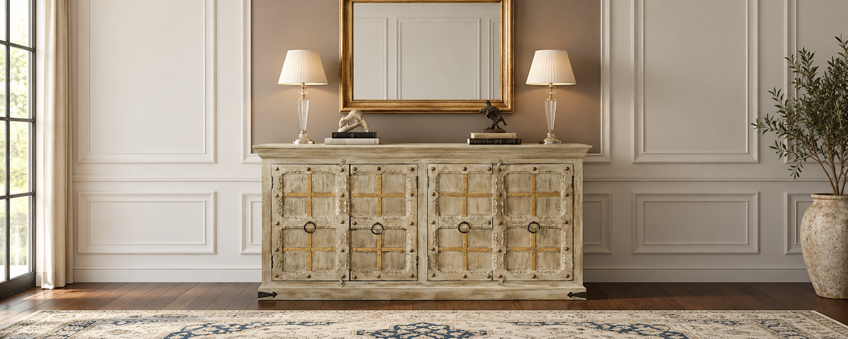
Paint is one of the easiest things to change in a room, while furniture is often a longer-term investment. That makes it worth choosing wall colors around your wood furniture rather than the other way around. Wood is rarely just "brown"; it can lean red, yellow, orange, gray or neutral. The wrong wall color can make a beautiful piece look muddy or flat. This guide explains how to identify your wood's undertone and choose a wall color that complements it.
Quick Answer
Identify your wood's undertone (warm, cool or relatively neutral), then decide whether you want the wall to harmonize with the wood or create contrast. Warm whites, creams and muted greens often complement golden or warm-toned woods, while soft blue-greens can balance reddish tones. Lighter neutrals can help dark wood stand out. Consider the wood's actual color, your room's lighting and other fixed finishes before choosing a paint color. Test a large sample beside the furniture in your own space.
Start With the Look You Want
Ask yourself whether you want the wood to blend into the room or stand out. Similar undertones can create a calm, coordinated look, while contrast can make the furniture a focal point. Consider your floors, trim and lighting before deciding which approach suits the space.
What Actually Matters
Read the Wood Before Choosing the Wall
An undertone is the hint of color beneath a surface's main color. As Oak & Loom's guide to mixing wood tones explains, warm woods tend to lean red, yellow or orange, while cool woods often appear gray or ashy. Neutral tones sit between these extremes. For a quick visual comparison, hold plain white paper beside the wood in daylight. Notice whether it appears more golden, reddish, grayish or relatively neutral.
Wood color also varies from piece to piece. Oak & Loom notes that natural wood can differ in color, grain and texture, and may lighten or darken with light exposure. Mango heartwood is typically golden brown, sometimes with yellow, pink or black streaks. However, the appearance of finished furniture depends on the wood, stain and finish, so judge your actual piece rather than relying on the species name alone.
Two Routes: Harmonize or Contrast
|
Approach |
What it looks like |
Works best when |
|
Harmonize |
A calm, coordinated look with subtle contrast |
You want a restful room |
|
Contrast |
The wood stands out against the wall |
You want the furniture to be a focal point |
|
Neutral buffer |
A balanced backdrop for different wood tones and decor |
You mix several finishes or may change your decor |
Wall Ideas by Wood Tone
These suggestions are starting points, not strict rules. The wood's actual finish, natural light and other colors in the room all affect the result.
|
Wood tone |
Wall colors to try |
Watch out for |
|
Light, honey or golden wood |
Warm white, soft cream, muted sage or soft blue-green |
Similar shades that make the furniture blend into the wall |
|
Medium brown wood |
Warm white, balanced greige, muted sage or soft clay |
Strong yellow undertones that compete with the wood |
|
Reddish wood |
Muted green, soft blue-green or creamy white |
Strong reds and pinks that exaggerate the wood's warmth |
|
Dark or espresso wood |
Warm white, pale greige or deep, muted colors |
Dark walls in rooms with limited natural light |
|
Gray or washed wood |
Neutral white, soft gray or pale blue-green |
Strong yellow walls that clash with the finish |
|
Painted or distressed wood |
Soft neutrals or complementary muted colors |
Wall colors that compete with the finish |
Light Changes Everything
A north-facing room often receives cooler-looking light, while a south-facing room may feel warmer. Artificial bulbs can also shift how colors appear. A cream that looks soft in the shop may appear yellow under a warm bulb. Check your sample in the morning, afternoon and evening, with your usual lamps switched on.
Look at the Fixed Elements First
Floors, trim, doors and countertops are hard to change, so consider them alongside your furniture when choosing a wall color. If your floor has reddish undertones, for example, a cool gray wall may create a stark contrast. Oak & Loom's guide to mixing furniture styles offers further guidance on coordinating different wood tones.
Sheen Matters Too
Matte and eggshell finishes can soften a wall's appearance and help conceal minor imperfections, while glossier paints reflect more light and may highlight surface flaws. A matte or low-sheen wall can let the furniture take center stage, while a more washable finish may be practical in high-traffic areas. Choose a sheen that suits both the room's use and the condition of the walls.

Test Before You Commit
Paint a large sample (about a square foot or bigger) or use a sample board and place it beside the furniture. Live with it for a few days and check how it looks in different lighting conditions. Small paint chips can be misleading.

A Real Example
Oak & Loom's Taos Rustic Carved Wooden Sideboard is made from solid mango wood and features a distressed finish with weathered, earthy tones. Warm whites and soft neutrals may complement its finish, but the product listing doesn't specify a wall color. Compare paint samples with the actual product photograph or piece before making your choice.
Common Mistakes
-
Choosing paint from a small chip. Sample large and test in your light.
-
Ignoring floors and trim. They count as wood tones too.
-
Picking a wall that matches too closely. The furniture can vanish.
-
Judging by the species name. Your piece may differ from the typical color.
-
Forgetting bulbs. Warm and cool lighting change both wood and paint.
Practical Checklist
-
Hold white paper beside the wood to assess its undertone.
-
Decide whether to harmonize, contrast, or use a neutral wall.
-
Check the floors, trim and other wood finishes in the room.
-
Test two or three paint colors on the wall or on sample boards at least a square foot in size.
-
View samples in the morning, afternoon and evening, with your usual lamps on.
-
Choose a suitable sheen based on the room's use and cleaning needs.
-
Recheck the colors after placing the furniture.
Conclusion
The best wall color depends on your wood's undertone, the room's lighting and the surrounding finishes. Compare paint samples with your actual furniture before committing. For more guidance, explore Oak & Loom's mixing wood tones and mixing furniture styles guides, or browse the sideboard collection to see different wood finishes.
Frequently Asked Questions
What wall color goes best with dark wood furniture?
Lighter walls such as warm whites or soft neutrals make dark wood stand out, while deep walls create a moodier room. In small or dim rooms, lighter usually works better.
What wall colors suit warm-toned wood?
Warm whites, creams, sage and muted greens are common choices. Avoid walls so yellow or red that they exaggerate the wood.
Should wall color match furniture exactly?
Not necessarily. Matching undertone gives a calm look; contrast makes furniture a feature. Exact matches can make furniture disappear.
How do I know my wood's undertone?
Hold white paper next to it in daylight and note whether it leans red, orange or yellow (warm), gray (cool) or neither (neutral).
Share:
How to Zone an Open-Plan Living and Dining Room With Furniture
How to Remove Candle Wax From Wood Furniture Without Damaging the Finish